Station usage over time

Hi,
I would be interested to see production breaks (lunch, shift change) from the test data.
How the station usage is going over a week? Or, on a average week in last 3 months.
Example a chart that would show a dot per every test execution start on a station or a Level during the last week. Could be changed to bar chart, where bar is executions per 15 minutes example.
If that is too simple, then this could have averaged yield coloring on top. Is there more failures before or after lunch? (Production possibly changes the product model at same time...)
What possibilities? Dashboard? Saved filter? Custom view trough API?
-

Hi Jouni,
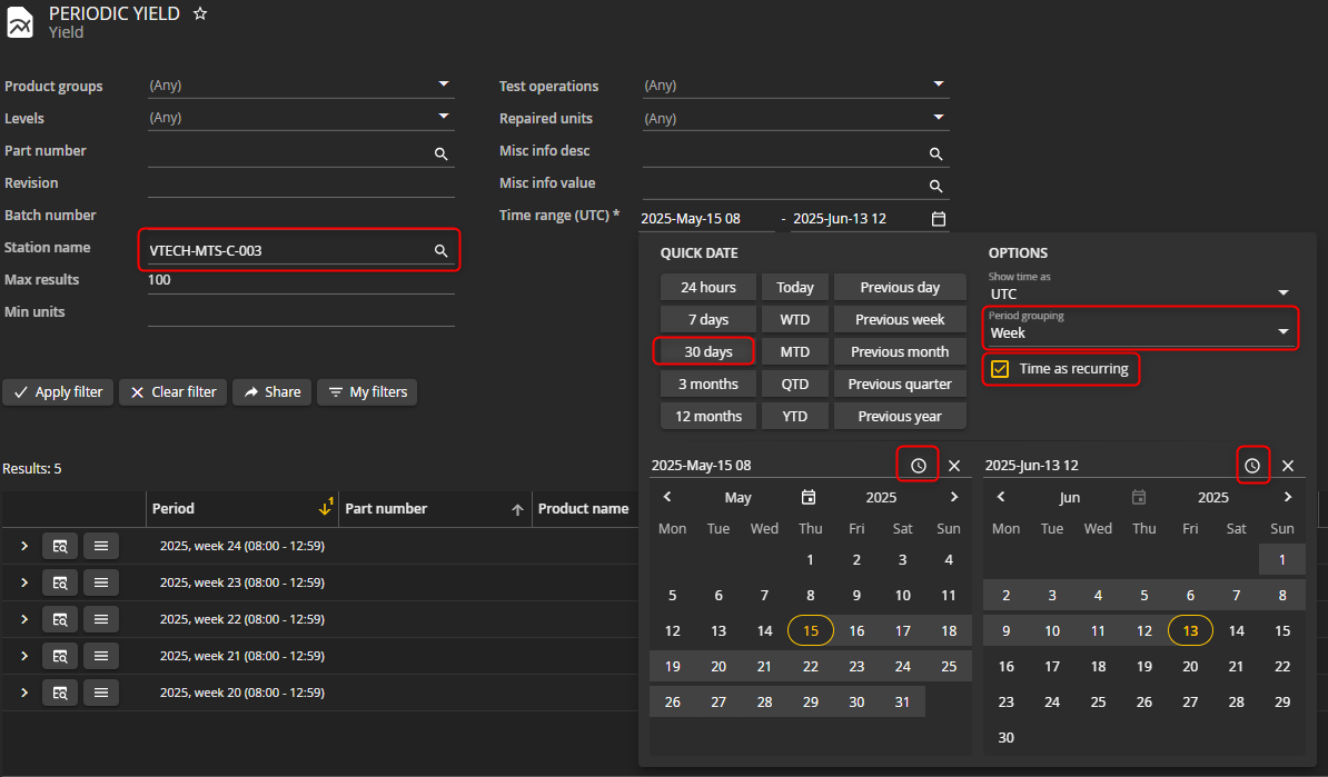
I would suggest checking out Periodic Yield - report made for looking at yields by periods (months, weeks, hours etc.), and change the filters to match your need. Here's an example:
Goal: See station yield before lunch grouped by week for the last 30 days. Do the same for after lunch to compare.
Filters used: Station, date, time picker, period grouping, time as recurring.
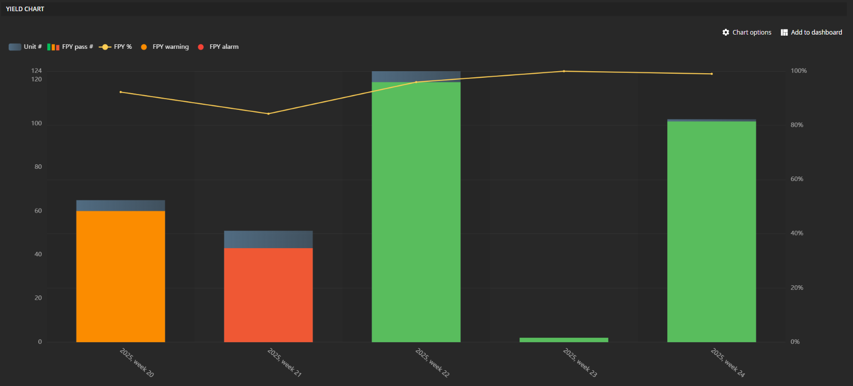
Result:
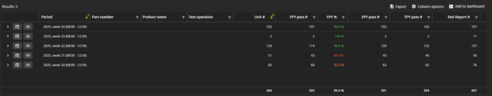
I can repeat this process, changing time picker for the hours after lunch and compare the two. I can also change grouping to hours if I want to see yield for each individual hour.
These views can then be added to a dashboard, exported, or added to your own view with API.
Hope that helps!
Haldor
-
Hi Jouni,
The shortest period grouping available in WATS is hourly.
Also, what you're describing sounds like station performance in the OEE report, i.e. how many percent of allocated time it's actually being used. However, for OEE, daily is the shortest period grouping available.
Haldor
Please sign in to leave a comment.
Comments
3 comments