Applying P-chart to the Periodic Yield view

Hi,
The Periodic Yield view provides very useful information on the monthly production statistics for a specific product.
However, there is an opportunity for improvement to see if the yields are within control or not. For this, by taking inspiration from what Minitab offers, we can embed the P-chart metrics in the chart to see the control limits and evaluate if the yield are stable or not. This is also useful, since from month to month we may have variable production volume. For example, the low yield of only 20 units of production may not be a bad sign, and we may need to wait to increase the volume and see if the yield is still low.
For better understanding of the topic, please refer to the links below:
Enter your data for P Chart - Minitab
Interpret the key results for P Chart - Minitab
Kind regards,
Amir Mousavian
-
Official comment

Hi Amir, I am not exactly sure what you mewan, as yield metrics in WATS does not have any lower or upper specification limits. The functionality you are describing is more relevant for test step analysis, where one actually compares measurements against specified lower and upper limits.
Can you please elaborate on how you mean this applies to the periodic yield charts, that shows yield for a products performance in a process, not measured values for a step with limits?
Are you aware of the Test Step Analysis report and how to use it?
Br
Ola ReppeComment actions -
Hi Ola,
What I'm talking about is showing the control limits on the chart below for the yellow trend line.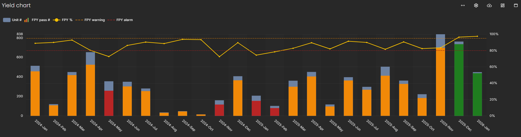
Here is an example that I've recently used in my Lean Six Sigma project using Minitab to show how the FPY is improved.
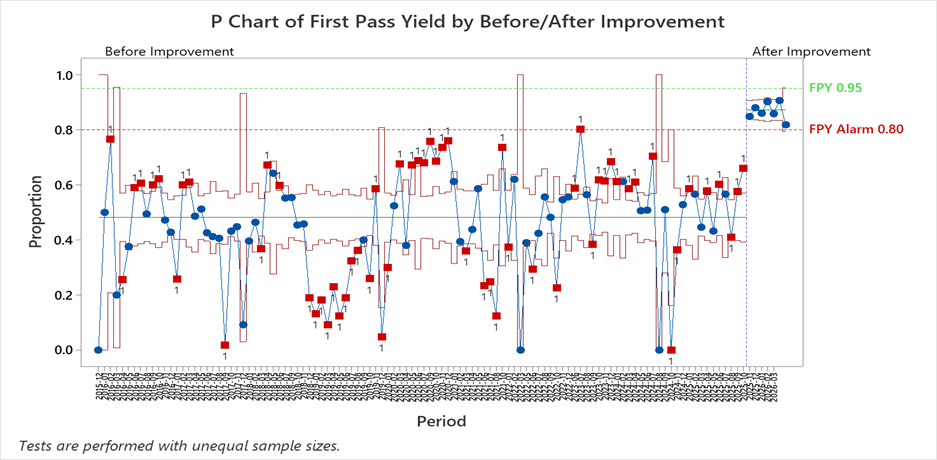 In test step analysis, I know what the spec limits are and how they are shown on the SPC charts on WATS.
If you want, I can show you how to make it in Minitab on a call.BR,
Amir Mousavian
Please sign in to leave a comment.
Comments
2 comments